Design Systems Browser Starter Kit ExampleDesign Systems Dialog Component ExampleDesign Systems Icon Set ExampleDesign System Tab Component ExampleDesign System Dropdown Documentation ExampleDesign Systems Tooltip Component Example

SP-UI

1 Design System
7+ Teams · 5+ Designers · 30+ Developers
Built SP-UI to align design and engineering on shared components, tokens, and governance for consistent delivery at scale.

Context & Strategy

Logo

Context & Strategy

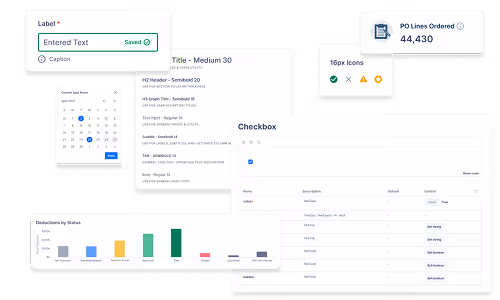
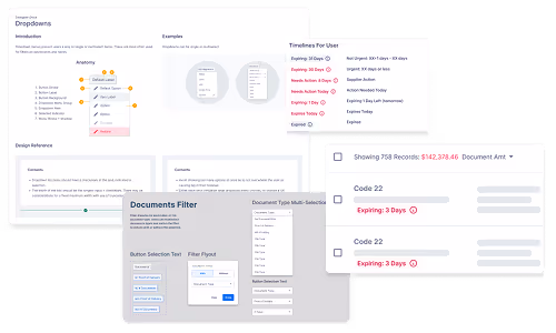
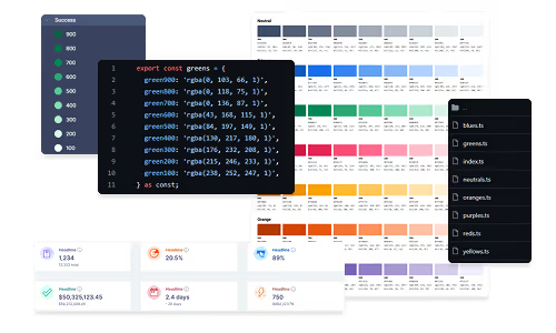
As SupplyPike scaled across products and teams, designers and engineers relied on disconnected libraries and front-end frameworks. Inconsistent patterns slowed delivery, increased QA overhead, and created growing design debt.
I initiated SP-UI—first in Figma, then in code—to unify standards and support sustainable scale.

Strategic Outcome

Established a unified design-to-development foundation that improved delivery speed, consistency, and maintainability across teams.
Users Icon

Primary users

Product Designers
Developers
Product Managers
QA
Frowning User Face

Core pain

Fragmented libraries and UI patterns
Duplicate implementation work
Design⇄dev mismatch → QA churn
Unclear ownership and governance
Trending Up Arrow

Expand Capabilities

Tokenized styles (Figma ⇄ code)

Reusable React component library

Standards + contribution models

Cross-team governance and adoption

As the product surface area grew, fragmented patterns and unclear ownership began to limit delivery and consistency.

Challenges → Impact

Logo
Adoption & Buy-In - SP-UI

Adoption & Buy-In

Early adoption was uneven—engineers hesitated to maintain shared libraries, and PMs questioned long-term ROI.
Proved value through faster delivery and fewer QA mismatches until SP-UI became the default foundation.

Ownership & Maintenance

No clear model for documentation, versioning, or long-term support.
Defined contribution standards and shared ownership to prevent drift and keep the system durable.
Ownership & Maintenance - SP-UI
Cross Team Governance - SP-UI

Cross-Team Governance

As more teams adopted SP-UI, competing priorities created divergent implementations.
Introduced review and release practices that balanced autonomy with shared standards.

Scaling to enterprise

Multiple products and frameworks increased complexity—and would have multiplied design + engineering overhead.
Abstracted reusable patterns and tokenized components to enable reliable expansion without rework.
Scaling to Enterprise - SP-UI

As adoption matured, the focus shifted from building components to building durable systems.

How I Drove Impact

Logo

Led System Architecture & Adoption

Spearheaded the creation of SP-UI from initial Figma libraries through production-ready React components, establishing a shared foundation for design and engineering teams.

Aligned Design with Business Priorities

Framed design system investments around delivery speed, QA stability, and long-term cost reduction to secure leadership and product buy-in.

Built Strong Design–Engineering Partnerships

Partnered closely with front-end leads to ensure components, tokens, and workflows were practical to maintain and aligned with existing infrastructure.

Established Governance & Enablement

Developed contribution guidelines, documentation, and training practices that enabled teams to adopt, extend, and sustain the system independently.

Results & Reflections

System Scale

1 Design System
20+ Core Components
7+ Product Teams
  • Unified Figma + React libraries into a single system used across 7+ product teams
  • Reduced QA mismatches by standardizing patterns, tokens, and handoff expectations
  • Shortened design → build cycles by giving teams a shared starting point
  • Shifted design debt from reactive cleanup to planned quarterly system improvements
  • Improved developer adoption through documentation, versioning practices, and reusable implementation patterns

What I Learned

  • MVP the system for stakeholders, but design governance for long-term scale
  • Adoption is the product. Standards only work when teams can’t afford to say no
  • Reducing design logic for engineers lowers inconsistency and unlocks faster delivery

11-Star Standards

  • Raised the bar from usable to durable: consistency, accessibility, and maintainability by default
  • Improved developer experience through clearer component APIs, documentation, and predictable patterns
  • Treated accessibility as a system constraint from day one